

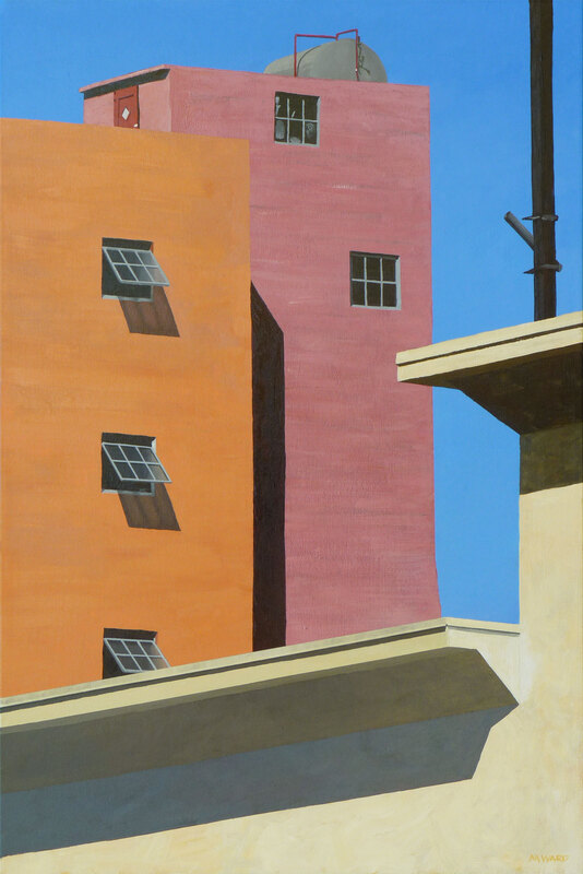
Michael Ward’s remarkable paintings focus their bright generous light on the things we don’t always take the time to look at, the places we often pass without notice. He finds the beauty and grace in the everyday and makes it timeless. We were very grateful to have the chance to ask him a few questions about his work.
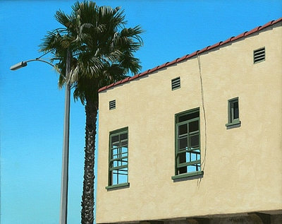
Magpies: You say that it’s always sunny in your paintings, but the brighter the sunshine the deeper the shadows. I’m very taken by the contrast between this sort of ideal of bright California sunshine and bright California colors, and the hollow spaces in windows or the shadowy doorways: That loneliness of catching a glimpse of other peoples’ lives, or maybe that feeling of decay under the cheerfulness. Can you talk about the balance of light and dark in your work, in any of the different meanings of the words.
Michael Ward: I arrived in California at the age of 11 in June, in the depths of June Gloom, which increased the trauma of moving to a new place. When the sun finally appeared in July, I was more than ready for it. There were lots of sunny days in Montana, where I came from (at least in spring, summer and fall), so getting the sun back helped with my acclimatization. Thus my love of sunlit scenes. Shadows are necessary for contrast, but I don’t see them as ominous. More a cool respite from the heat of the sun.


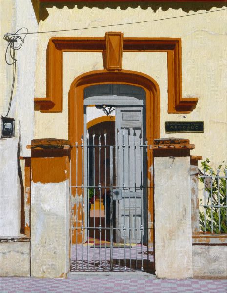
Which I think brings us in a way to your Home is Where the House Is series. What are some of the ideas behind these paintings?
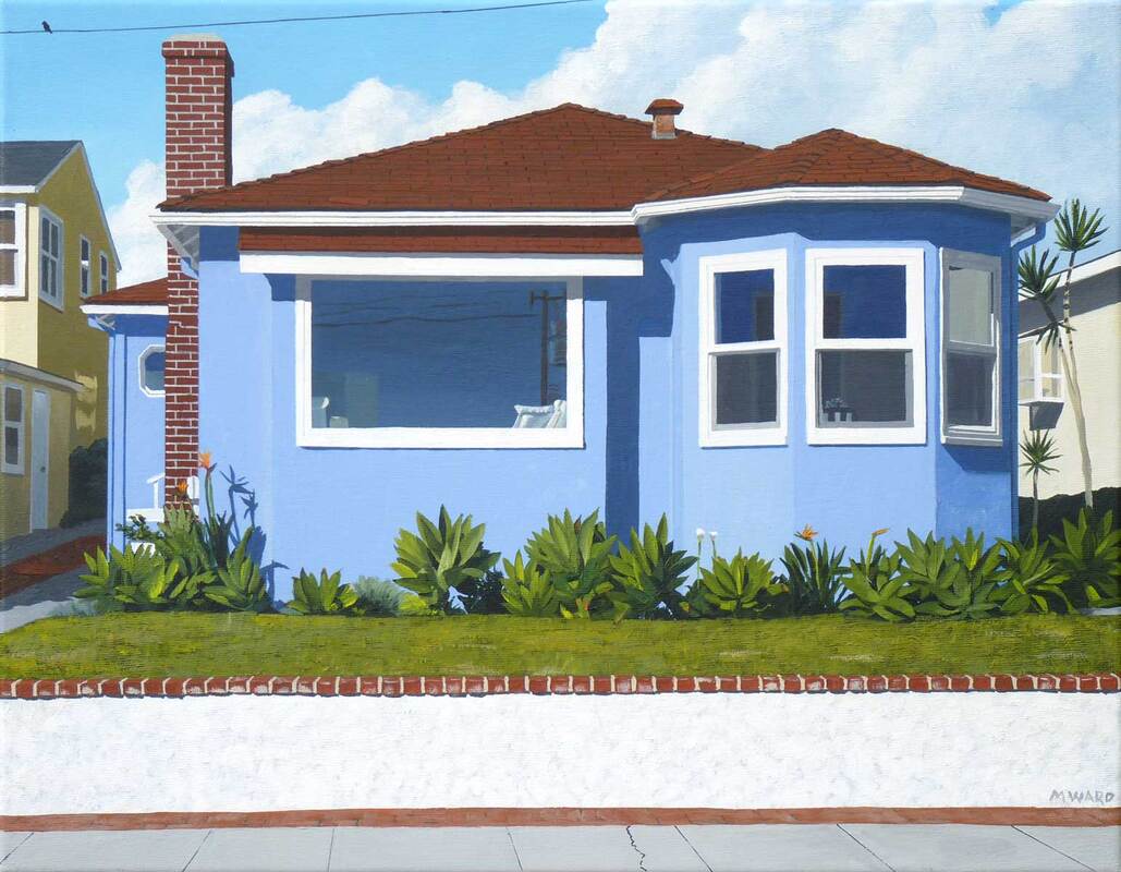
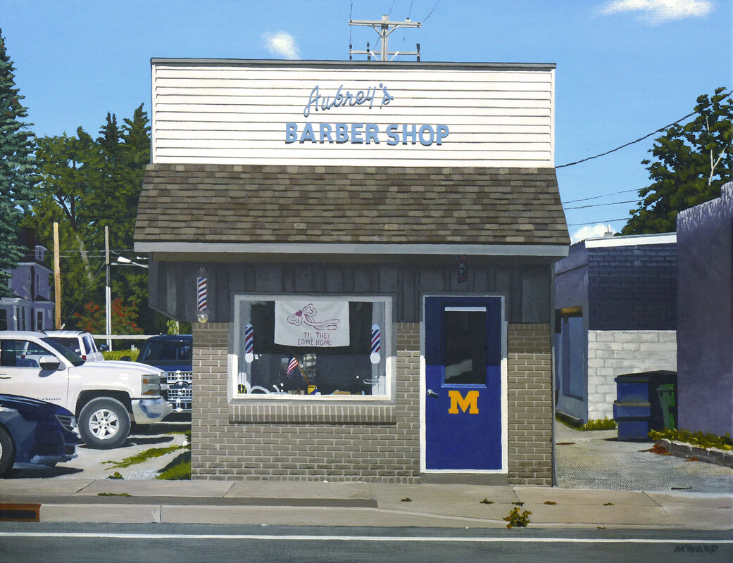
I started this series with a painting of a house near where I grew up, Bozeman #1. I even recolored it to be closer to the color of my childhood house. The other houses I’ve done are mostly from that era, from roughly the 1930s to the 1950s. Houses from this era tend to be modest in size and design, with minimal architectural ornament. They are where ordinary people live their lives. When I display these paintings to the public, I’m surprised by the emotional responses they generate. Most people relate to them as places where they lived, or their parents, or grandparents. They’ll tell me, “Grandma lived in a house just like that” even though it may have only a slight resemblance. Since the 1960s, houses have gotten steadily bigger (and the lots smaller), so there’s more room inside, though it’s mostly empty, or stashed with junk we don’t want to deal with. Those mid-century houses had small rooms, and everyone was close together, for good or bad. Also, house facades from that era are not dominated by garages, as later ones are. You can actually see into them. That makes them more interesting as subject matter, and more approachable. My longtime friend D. J. Waldie wrote the definitive book on suburban houses, Holy Land.


It’s interesting to me that you work from photographs, and though your paintings are realistic, they don’t always represent the exact reality of the photograph. You might add a person or a dog, or move a person or car you observed a block away into the frame to add to the narrative. Two questions on this subject: How do you decide what to include or leave out? Do you have rules for yourself or patterns you follow to fit your artistic style or is it just a feeling with each painting?
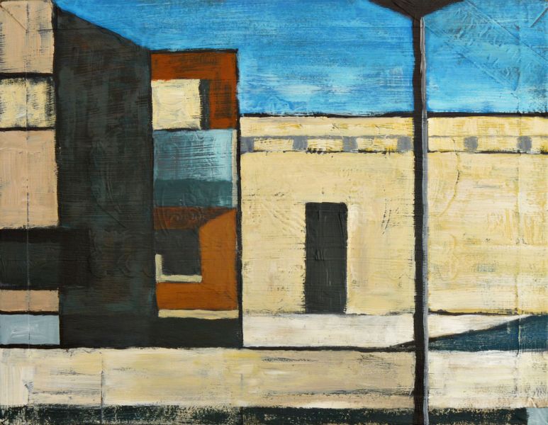
I’m always making changes to the source photograph, sometimes subtle, sometimes more radical. Sometimes it’s a matter of moving or removing a light pole to enhance the composition. I might change the colors a bit for the same reason. Also I might add a person or a dog, which always suggests a narrative of some sort. Each source image suggests its own modifications. Sometimes it is complete enough that I don’t make changes, other times I’m combining several images to make something completely new.
And to what extent do you feel you’re more of a film director, turning a still photograph into a narrative that we sense has a before and after that lives beyond the frame of the image?
I see myself more as a documentary director than a narrative one. I feel an obligation to be faithful to the source material. But in any documentary, there are aesthetic choices to be made, so the “verité” is never absolute. The ultimate goal is to make people see, to recognize, and appreciate. So if a little modification gets us closer to that goal, I’m fine with it.


Still on the subject of photographs – you often paint from photos you took years or even decades ago. Looking at old photographs can be emotional and discombobulating enough, and I imagine that painting them takes that feeling to another level. To what extent are you communicating with ghosts of places or people or your former self when you paint?
Ghosts, yes indeed. I recently finished a painting of two of my cousins, based on a photo my father took circa 1955. It shows them in front of my house in Helena Montana, setting off on a trip in my grandfather’s car on a trip to Canada. One of the cousins has died, so I was dealing with her ghost, but also my father and grandfather, and the ghost of my childhood. One of the nice things about painting from a photograph is that you get to explore every element of the image, in a way that a casual glance can’t accomplish. So I get to see things that otherwise go unnoticed. For instance, in the painting of my cousins, there’s a letter on the floor of the car. Who is it from? What does it say? We’ll never know, but at least I know it’s there. I’m definitely communicating with my former self, obviously in the photos I’ve taken, but even in this one, where I’m probably back in the house asleep in my crib. I’ve come to see my paintings as self-portraits, even though my image is not in them.

Similar idea, I guess, I’m curious about the role of nostalgia and memory in your paintings. It feels as though your paintings are such an honest and genuine portrayal of a certain time and place, a moment. We don’t need to read that there was a church across the street and a daycare around the corner and that they’re all gone now to understand that you know all that. I suppose that it’s that slice of reality that resonates so powerfully with people who also share a memory of some aspect of that time or place. A connection based on pieces of a shared past.
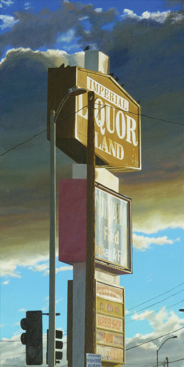
I’ve had people argue with me about the where and when of a particular painting. Obviously they are wrong, but in a certain sense they are right as well. Even though my paintings are realistic, that doesn’t stop people from reimagining them based on their own experience. I have a painting of an empty, abandoned sign (Weedmaps), that evoked very strong emotions in a viewer, who told me it reminded him of similar signs he saw in his youth, while traveling from place to place with his father. He was almost in tears relating his memories. The sign was in Tucson; he was from Equador.

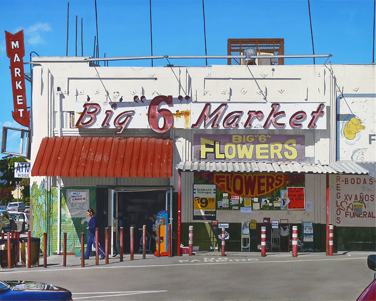
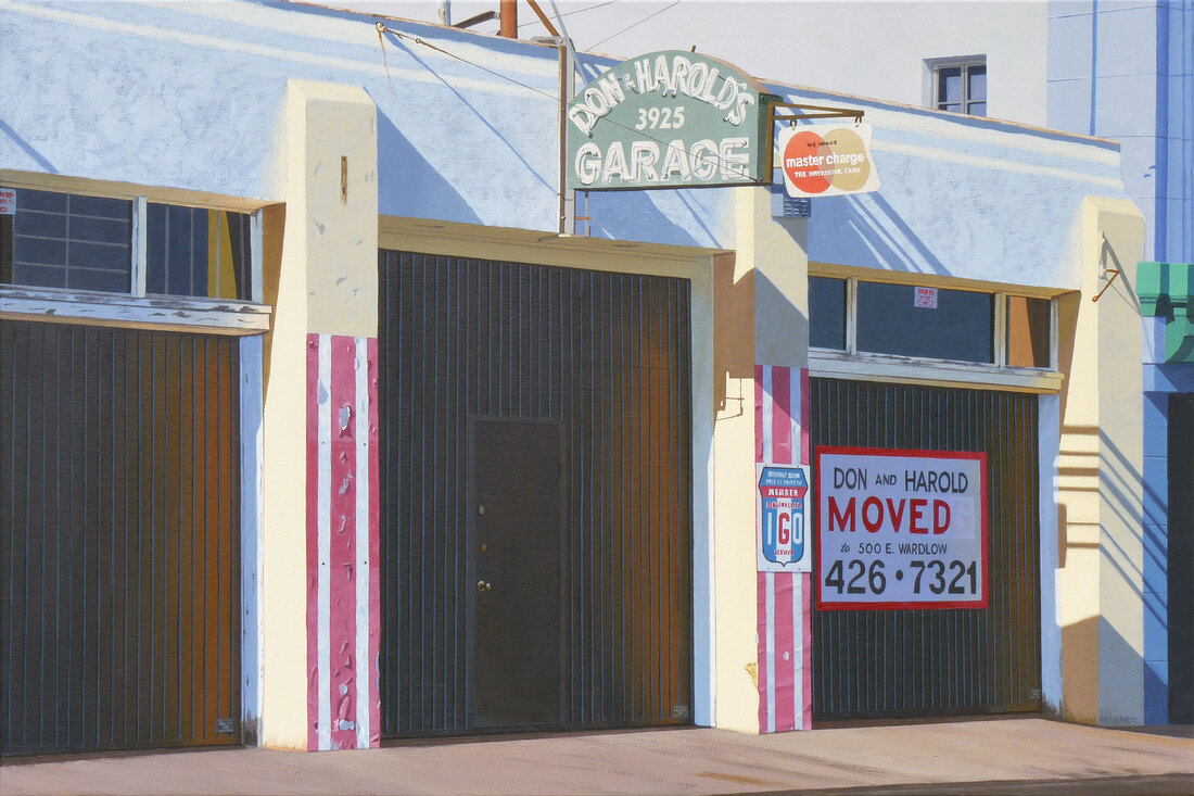
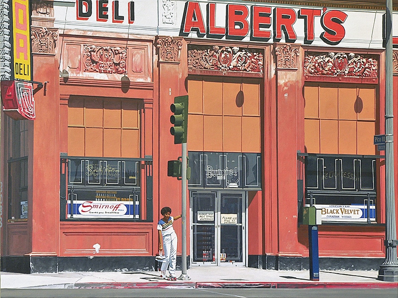


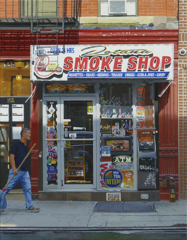
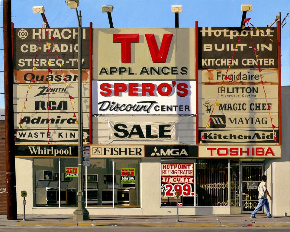
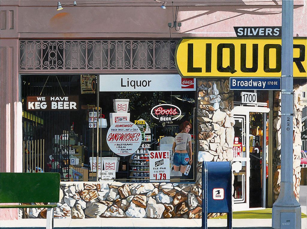
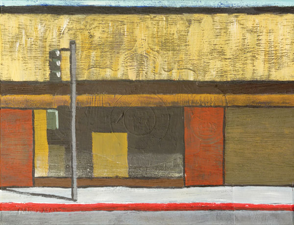
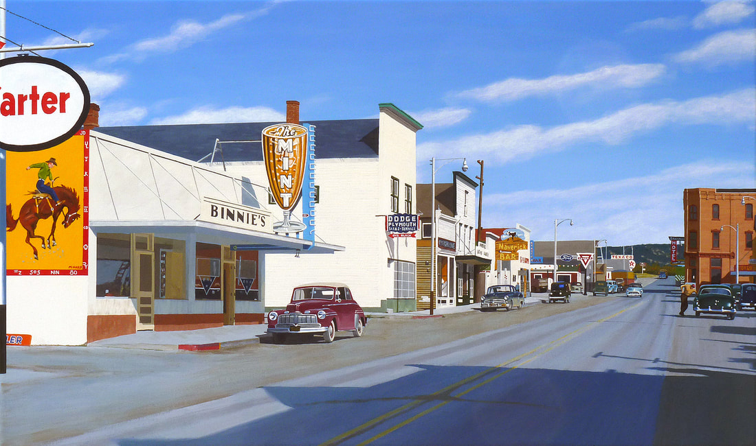
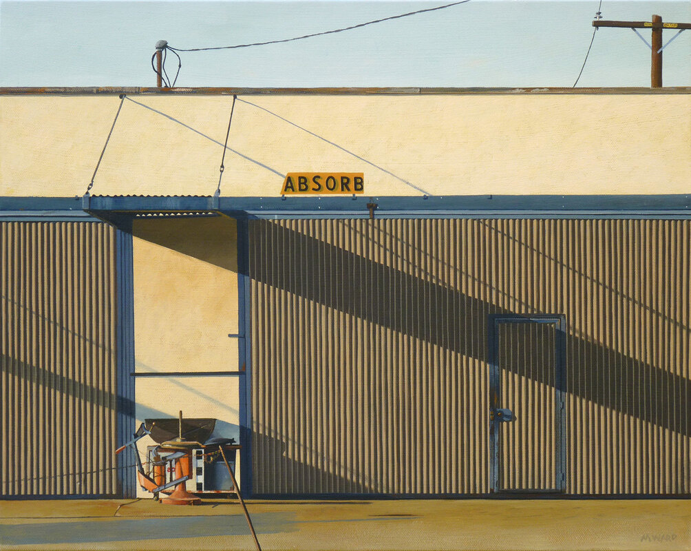
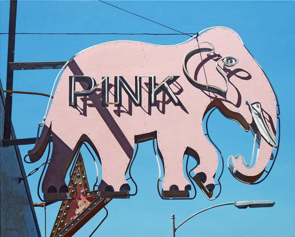
I love paintings with a lot of text in them, especially if that text is very graphic, and your paintings of signs strike me as very moving, in a layered way. There’s the sense of their original purpose – to sell something, which seems so hopeful or foolish in the light of the decay and clutter that have accumulated on many of them – the neon that is more shadow than light after many years. Then there’s the idea that people pass these signs, which are (or were) yelling so loudly, almost without noticing, because they’re so familiar. Then there are the little phrases or pops of meaning you find in the words and the pieces of words that have nothing to do with their original intent. Can you talk a little about your sign paintings?
I was a graphic artist in my work life, and my father ran a print shop when I was a child, so I have spent most of my life working and playing with typography. So it naturally became a subject for my photography, and then my painting. One of the very first paintings I did was of a lovely neon sign for a bar in my hometown of Long Beach, CA, Valentine’s. That was my introduction to neon and the difficulties of rendering it. My most recent painting is of a sign shop, also in Long Beach, which features a gigantic sign reading “Signs.” So a sign to sell signs—very meta. In between I’ve done a lot of paintings featuring signs or other typography. In keeping with my documentary aesthetic, I tend to keep the misspellings and crude letter forms (of the handpainted ones), but sometimes I make alterations. For Tire Sale I left the word “baloons” as it added to the charm of the image. I’ve recolored a few signs, such as “Sin,” which was actually green, but I made it a more sinful red. I also cropped the full sign, which read “Sincere.” As you say, signs are all around us, and we tend to ignore them. But we do the same with most things in our daily life, so I use the power of the painted image to focus our attention on them.
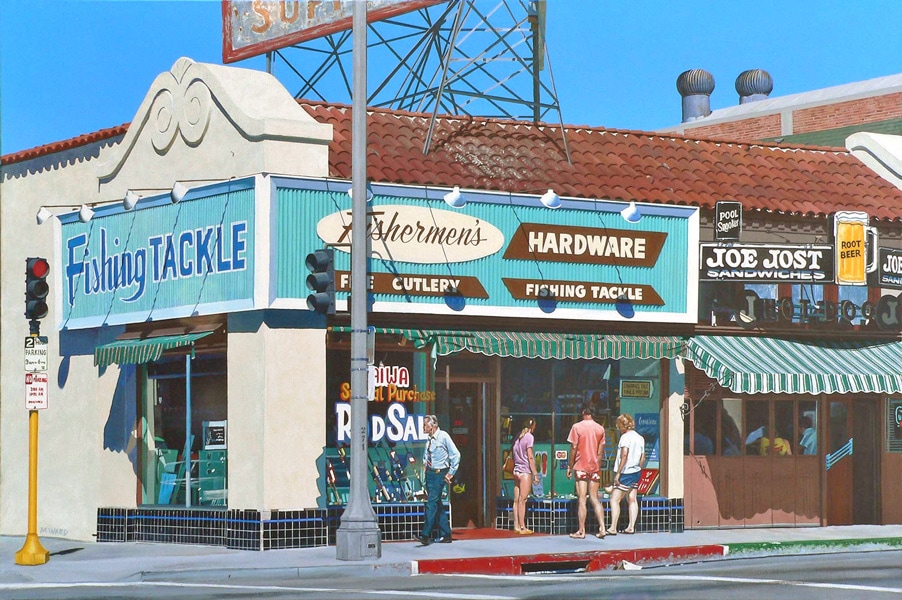
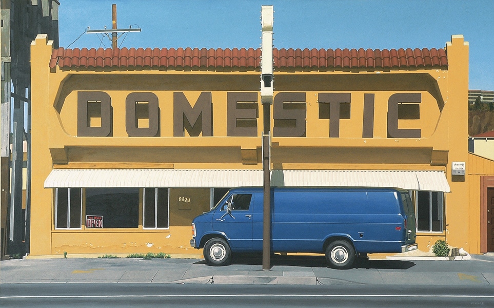
Which leads us to the idea of reading your paintings. Some of your paintings of convenience stores or liquor stores have layers of meanings: histories, signs, the occasional movement of people or dogs, the mysterious light inside of doorways or windows. There’s an idea that you’re discovering the scene as you paint, and we want to take the time to do the same while we look at the painting. Can you describe the process of painting such a complicated scene? How do you hope the viewer will read the images?
For me, the process of painting is a process of discovery. Something in the source image must have caught my eye, or I wouldn’t have taken a picture of it. This was especially true back when I was shooting film, and only had a limited number of exposures, but it’s still true today. Once I select an image and start painting, I have to figure out how to render what I’m seeing in paint. This often involves taking an image apart in my mind and reassembling it. For instance, when I do foliage, I usually start by blocking in the darkest parts with a deep green—I use Hooker’s Green Dark, which is almost black. Then I layer lighter greens on top, which adds depth. The final layers might be pure yellow or white to capture the highlights. A sign or a store window proceeds similarly, usually working from the darkest color forward. Sometimes in a complex scene, there will be stuff I can’t figure out. Close scrutiny might be enough to figure things out—that blob in the gutter is actually a discarded drink cup—but sometimes the mystery remains a mystery. Then I have to decide whether to paint the blobs of color as they appear, or leave them out. Usually I paint the blobs. And sometimes the mysteries resolve themselves once the painting is done. It’s sort of like watching a movie, and wondering, “Where is this going?” Usually by the end you find out (maybe not if it’s a David Lynch movie), but either way the journey is fun.
When I’m painting complicated scenes, I like to tackle the easy stuff first, chipping away at the painting. That way, what’s left doesn’t seem quite as daunting, and eventually it all gets done.
I don’t usually have an intention as to how the viewer will read the paintings. I’ve found that viewers take their own paths, and come to their own conclusions. Often, it’s something I never expected.


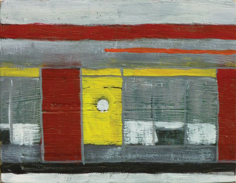
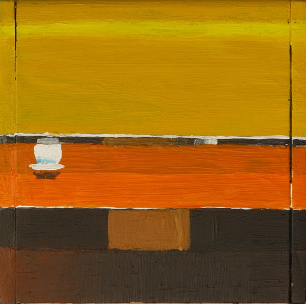
If your large paintings are like novels, then your smaller paintings on boxes are like poems, breaking down the images to the essentials of light, shadow, shape, and color. They’re so beautiful! Is there some sense of release or freedom in painting them? Or is it almost the opposite because, as in a poem, each element has to carry a great weight to convey the emotion or meaning of the piece?
The cigar box paintings were inspired by seeing some paintings that Richard Diebenkorn did on cigar box lids. I thought that would be a great thing to try. I needed a starting point, so I took some of my existing images and abstracted them into rectangular and angular shapes. To my surprise, I discovered the underlying compositions to those images. Not having to render fine details was freeing. I could concentrate on shapes, and textures, and layering colors. It also gave me even more respect for Diebenkorn. Even his cigar boxes are way better than my attempts.


The phrase “The one that got away,” is a constant in your work, and it’s one that I love for its tug of regret, disappointment, resignation, but with somehow humor or hope thrown into the mix. What does the phrase mean for you and your paintings?
That’s actually a series of postings I’m doing on Instagram, showing my sold works. That allows me to post stuff on a regular basis without repeating myself too much. But it brings up the issue of the trauma for artists of parting with your work. Selling work is a necessity, if an artist wants to support himself, or just make room in the closet for more work. There are only so many relatives you can foist art onto, at least in my small family. So these children have to leave home. Some of the really good ones, or really personal ones, are hard to part with. But they have to go. Parting was hard at first, when I was just starting to paint, but it’s gotten easier over the years, especially as my storage space has filled up. Still, there’s a bit of trauma when something sells right off the easel, as happens once in a while.
I have a few stay-at-home children that I’ll never sell, because the works are too personal. But I’m happy to paint a new version, if you ask nicely.
The source images I paint are themselves often “ones that got away”, as many have changed or disappeared over the years. I used to think of it as “the Ward Curse”: I’d paint something, and some time later it would get demolished. But I live in southern California, so the chances of any particular thing getting torn down tomorrow are pretty good. Sometimes I know a subject is imperiled, like the La Palma Chicken neon sign, sometimes I’m documenting the going away, like the Hotel Schuyler painting.


Your paintings seem, to me, to be an expression of American mythology. Your windswept Michigan barns or bright Long Beach neighborhoods capture something quintessential. But they also capture that unique American eccentricity and strangeness, and all of the ways these aspects of our life and culture evolve over the years through community, loneliness, hope, decay. To what extent do you think about your work as part of the American landscape (in whatever meaning you want to give to the word)?
Grand ambitions are good, though those of us who achieve them are rarely happy. And grand vistas are beautiful, but there’s lots of interesting stuff right at our feet. That’s the landscape I’ll be painting.
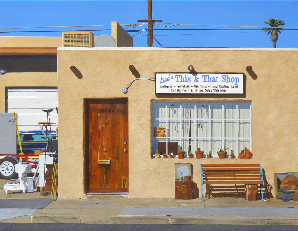
I’m an American, painting images that I’ve photographed in America, so yeah, that ends up being American landscape. Some ideas of American landscape are clichés: yellow taxicabs in New York City, Monument Valley in Arizona, crashing waves in Maine or California, motels on old Route 66. I try to avoid all that. I’m more interested in ordinary places, where ordinary people live. Hence the simple houses, the liquor stores, the small business storefronts. America has always been a place of grand ambitions and grand vistas, but most of us are ordinary people living ordinary lives in ordinary places. There’s a dignity and grace in that. And that’s what I want to paint. Not Half Dome, but the parking lot next to it. Not Times Square, but the restaurant supply store down on Orchard St. in the Lower East Side. Not the seaside cliffs in Laguna Beach, but the decaying garage on Glen Eyre Street that the developers forgot to tear down. My painting, Hard Living in Paradise, epitomizes this. In the background are the very scenic Spanish Peaks that tower east of Bozeman, Montana. In the foreground, where the real interest is, are several trailers and some well-used vehicles. Even in Paradise there are people just getting by, who are there not by choice but by circumstance, trying to live their lives. That’s what interests me.
Grand ambitions are good, though those of us who achieve them are rarely happy. And grand vistas are beautiful, but there’s lots of interesting stuff right at our feet. That’s the landscape I’ll be painting.

Michael Ward is a self-taught artist, living and working in Costa Mesa, CA. See more of his work on his website and on Instagram.
Categories: art, featured, featured artist, interview

