


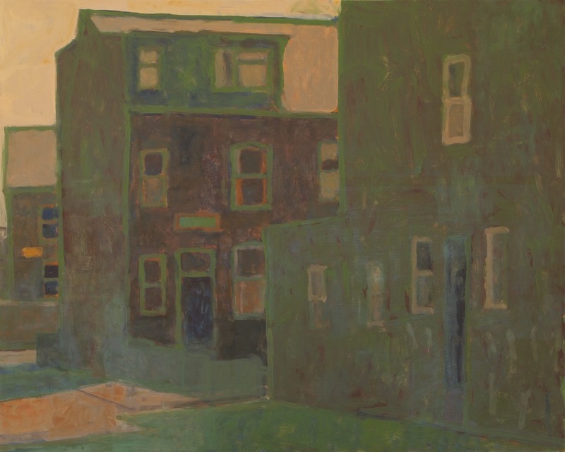
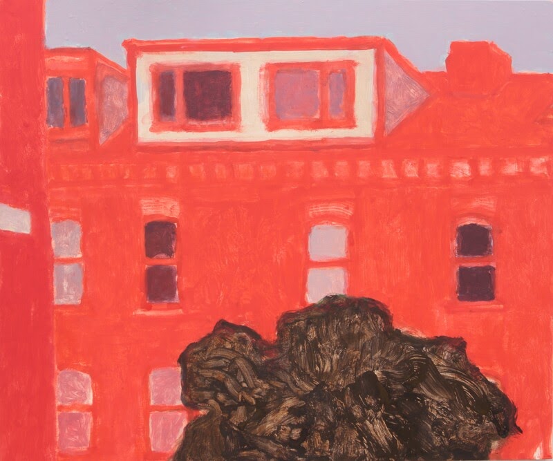
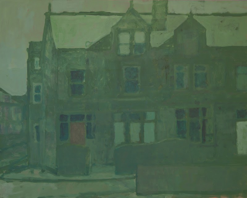
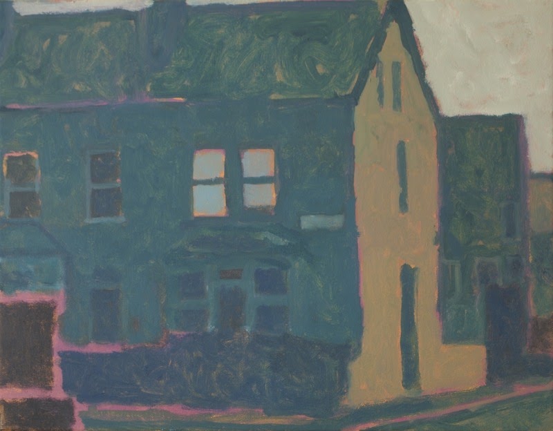
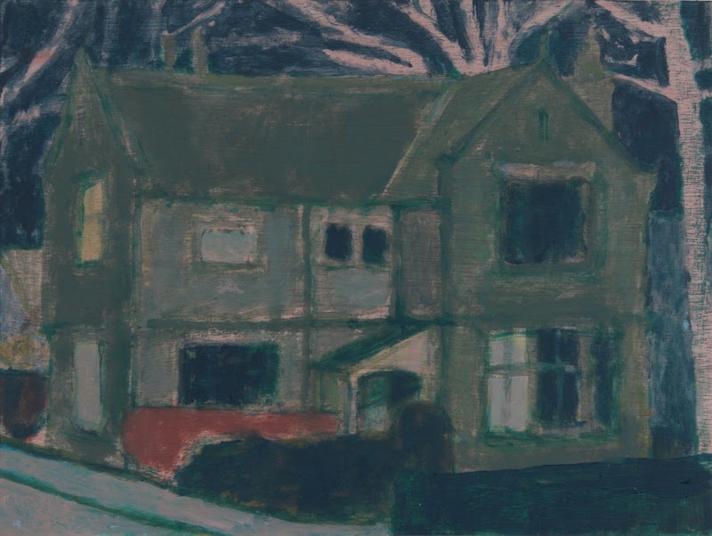
Jonathan Hooper tells us that his subject is the built landscape of the city and suburbs of Leeds. He approaches his subject with a powerful poetry, stripping buildings and structures to their perfect essence, and reimagining them with such a uniquely personal way of seeing that it becomes oddly universal. These are buildings that people pass through every day, eating and sleeping and living and dying, where they have been doing so for decades, if not centuries. It might not be the everyday for us in this particular location, but somehow the evocation of the memories and emotions connected to place is an experience that brings us back to our homes and our histories, that resonates with as loud a hum as the strangely perfect colors and forms of the paintings. Together these images feel like some rare estate agent’s cataloging of lived experience, and of the memories and dreams of spaces. We were grateful to have the chance to ask Jonathan Hooper a few questions about his work.
Magpies: I’m so moved by the color in your work. It hit me in a few different ways, which are all hard to put into words, so I apologize in advance for this convoluted and lengthy question. Mostly, it made me think about the places we live and all that they mean to us.
Are we seeing the glow and shadow of memories, which I believe is all that’s important about a building, in the end. I think that’s the impression that I was left with. It evoked that feeling of places I’ve lived, which are so vivid in my dreams and memories, though I can’t remember all the clutter and furniture and objects in them. It’s just humans moving through this structured space, making connections, coming apart, being born or dying – and the everyday important things, cooking meals, making art, caring for each other, or hurting each other. All of that resonates with warmth and coolness I wouldn’t have thought someone could capture, but I think you did.
Can you talk about your use of color: how you choose it, what it means to you? The process and the thought and emotion behind it.
Colour is the way that I seek to convey the total experience of a place — an experience that is only partly visual, but physical, emotional and built from memory as well.
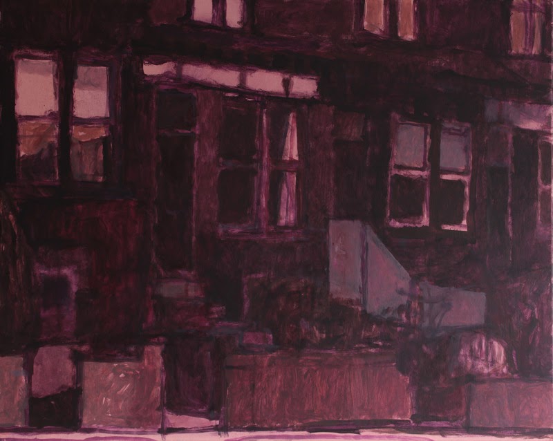
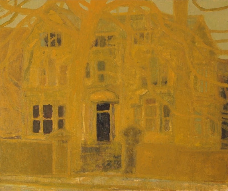
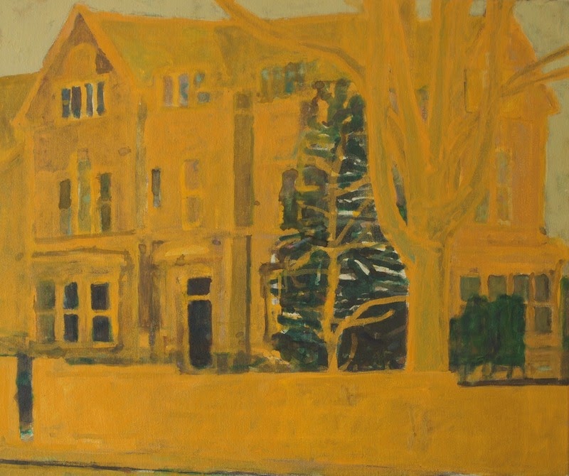
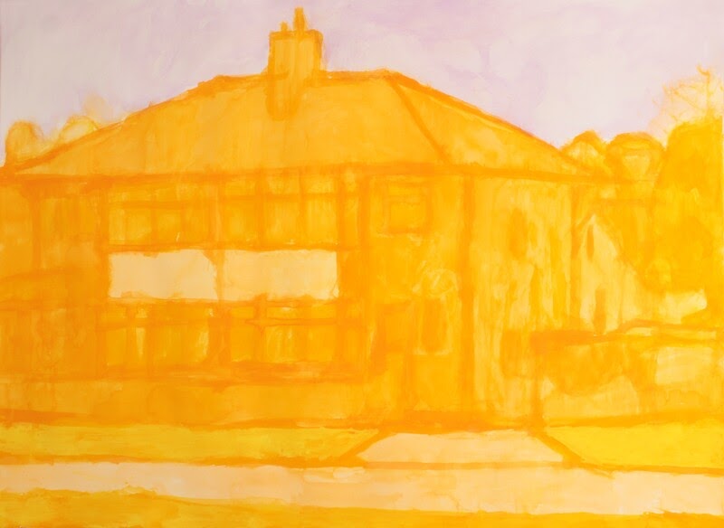
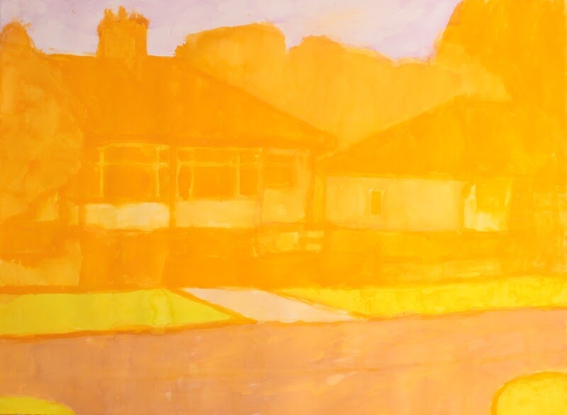
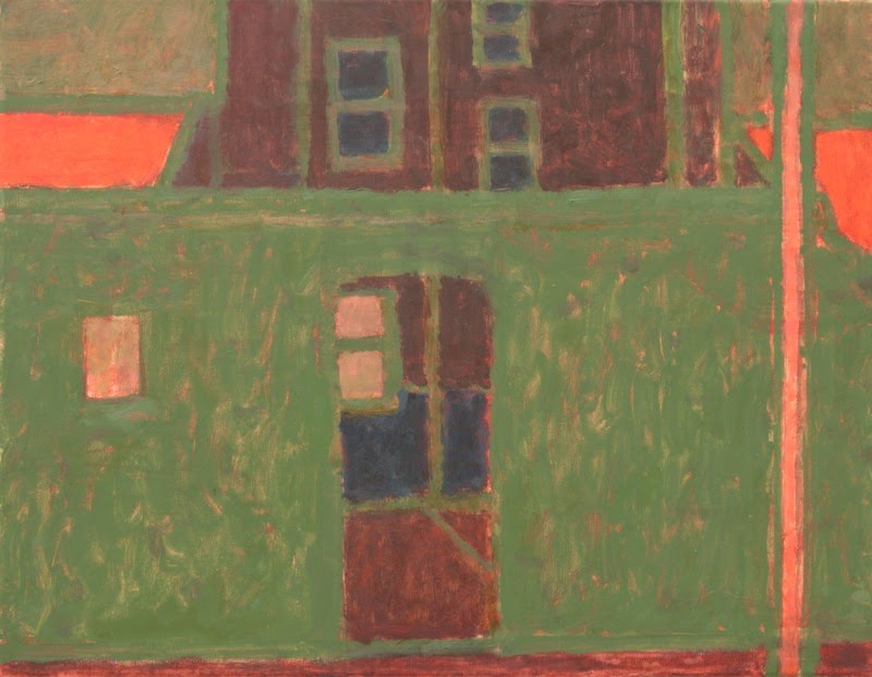
JH: For me, colour is fundamental to painting. What made me determined to be a painter was the experience of seeing one of Derain’s River Thames paintings at an exhibition in London — it was a revelation to me, the power that colour can have to speak directly and emotionally. Colour is the way that I seek to convey the total experience of a place — an experience that is only partly visual, but physical, emotional and built from memory as well. Naturalistic colour cannot — for me anyway — work on these levels.
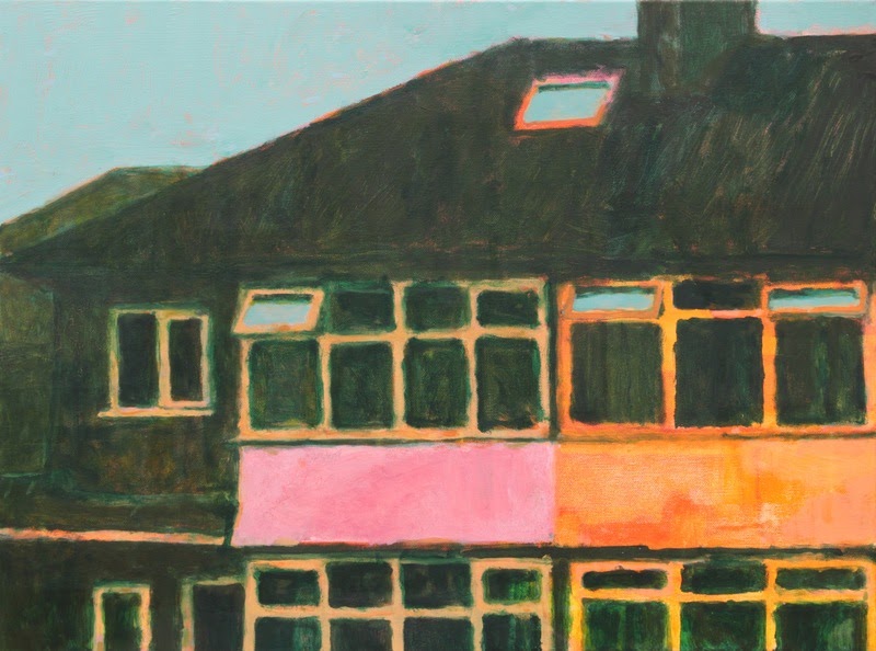
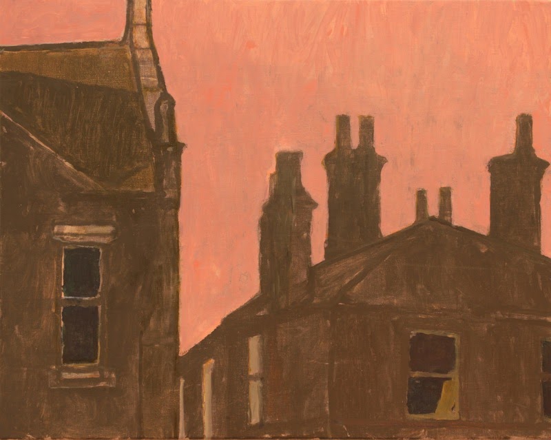
The colours that I use come partly — and sometimes tangentially — from the subject itself, and my memory of it (I work from black-and-white photos so that I don’t get distracted by photographic colour). Also at any one time I tend to be obsessed by some sort of colour idea — at the moment it is the family of ochres, burnt oranges, browns, reds and violets you get by mixing various oranges and greens. And I improvise with colour in watercolour drawings — sometimes I move right away from the original idea, and sometimes I focus down into it, simplifying and refining it.
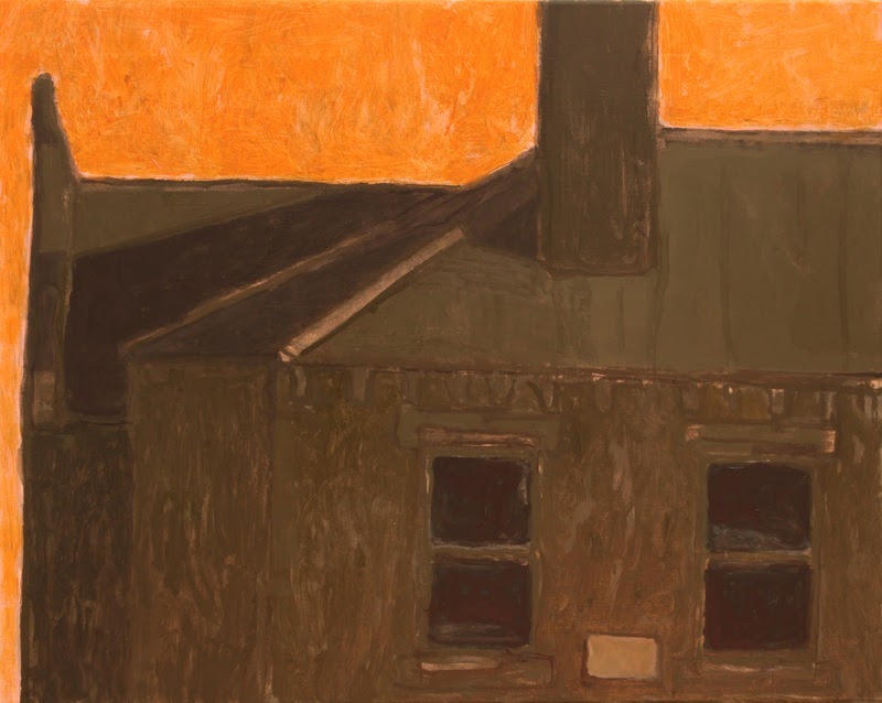
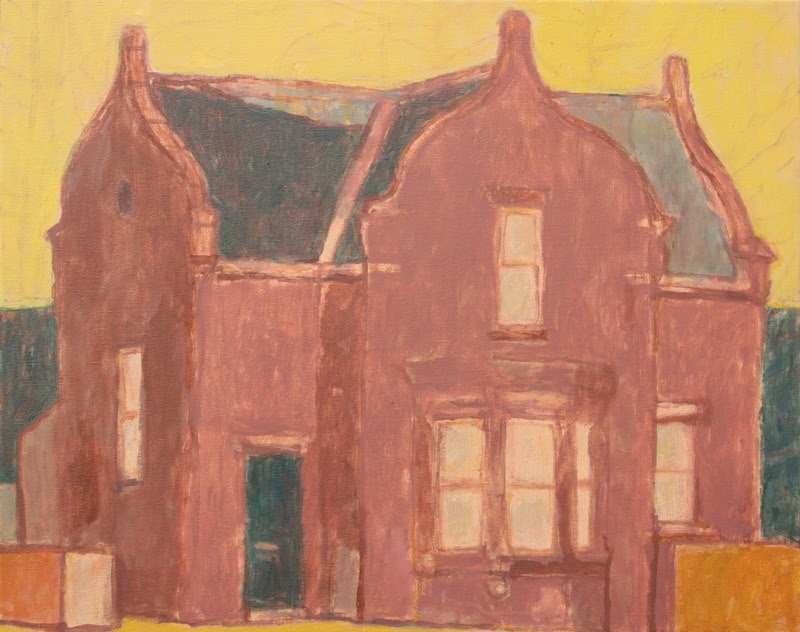
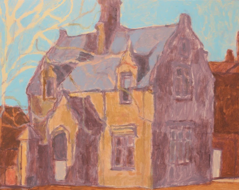
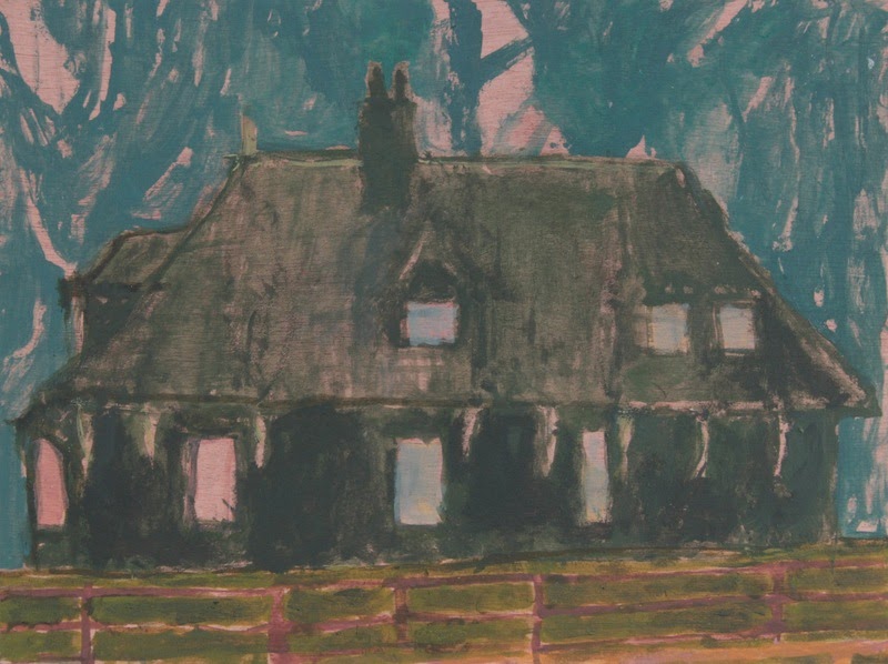
It is interesting what you say about memory and the history of people living in the buildings — this is a big part of why and how I paint them, and as I say it is part of the reason for using non-naturalistic colour. I’ve lived in Leeds for thirty-four years, and in that time I’ve lived in many houses just like the ones in my paintings, and I feel a very deep and personal connection to them. I’m trying to convey that in the paintings rather than just presenting the visual appearance.

Also, about color. The drawings and paintings almost reminded me of one layer of a print, in which colors are built up pass by pass. I’ve always thought that a certain stage of the process just captured a sort of glow or essence of the image and subject, and I feel like you’ve embraced that moment. Have you worked in printmaking, or does that process inform your work?
That’s very interesting — my degree was in printmaking, and the way I use colour in my paintings is consciously and directly influenced by my experience of print.
Printmakers are used to conveying the whole gamut of light and colour with a very few inks — even just one ink — for example to use the same vermilion to stand for the brick of a house, the grass in front of it, and the sky behind. This is a very different colour approach from that used in much of painting. In printmaking, colour tends to be simpler, flatter, more arbitrary and schematic, more planned. It is used as a constructive element: the image is built out of patches of colour rather like a child makes a building out of wooden bricks.
I can identify with what you say about the intermediate stages in a print — and one of the joys of printmaking is the way these states are revealed all-at-once in a glorious surprise as you lift the paper from the plate or block. I am looking for something of that all-at-once-ness by how I use colour, and how the image is cropped and composed.
About place: I’m fascinated by the idea of creating art from things you observe in your neighborhood. I think a lot of artists discovered the beauty of this during the pandemic, but it seems you got there first. I’ve lived in the same town for a couple of decades, and I take pretty much the same walk with my dog every day. I love love love seeing the small difference day to day, in the shifting light, the decay of natural or human-made objects, the way things grow and die. What sort of connections or dissonances attract your attention between streets or houses or bus shelters?
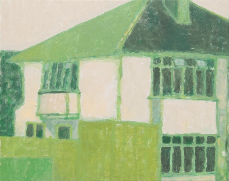
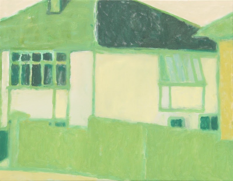
Yes, I had been slowly moving in that direction before spring 2020. In my first Leeds paintings in 2009 I was painting street scenes all across Leeds, thinking more about what fitted my preconceived idea of a cityscape painting than about the subject and my relationship to it. Over time, I found myself increasingly drawn to the domestic architecture of my own neighbourhood, but the events of spring 2020 did make a big difference, to the point that (with very few exceptions) all of my subjects since then have been within a 30-minute walk of my home.
The primary connection I have to my subjects is the sense of home. All of my subjects are very close and familiar to me, over an extended period of time. Obviously, people viewing the paintings may not have the same specific connections, but I hope that the paintings can also be metaphors for the general idea of home, and people can bring in their own connections and memories to them.
It occurred to me recently that I don’t often dream about the house I live in now (and have for 20-something years). I dream about my childhood home, or my grandmother’s home, which I rarely visited, or some strange house I’ve never been to that doesn’t exist. What houses do you dream about? Do dreams, dream-light, or dream-logic inform your work?
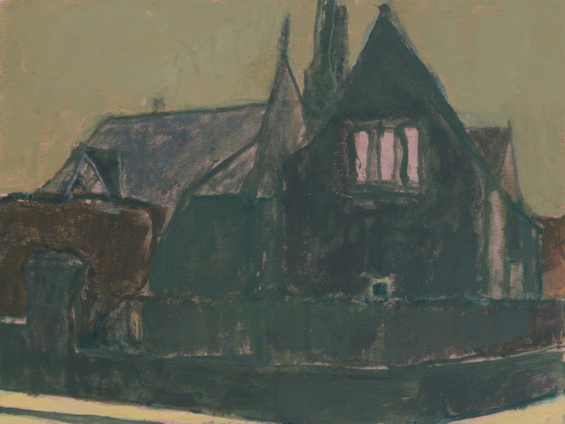
Not really dream-light and dream-logic. But dreams, memory, imagination, and the internal maps and images we hold of places do play a part: I am trying to show the way our homes exist permanently in our minds, not just how they look to the eyes at a particular time on a particular day. I want the essence of a house, not its appearance — as if someone was asked to draw a picture or a plan of their own home from memory.
I sometimes dream about the house I lived in as a small boy — a semi not unlike some of the ones I paint now, although in a different part of the country, with a wooden gate and a cherry tree in front. (I walked past it again recently and it has changed so radically that I couldn’t recognise it at all — to me it will always be as it was when I knew it). Other than that the places in my dreams are public ones like train stations, hotels, streets, bridges, gardens and forests.
Your work feels so poetic to me in the way that you distill images and meaning into the essential and eloquent. As a word person, I was particularly struck by the way the titles of some of the paintings felt like poems and changed the way I viewed the images. Titles like Such a Long, Long Time pack an emotional punch because time passing is the strangest, most wonderful, and most terrible thing. But even titles like Northern Sky make you shift your focus, and also make you recall the way skies hit you at different times of day or year in different places. How important are the titles of your images?
In the past I always had problems with titles, partly because I make so much work — often of the same place — and partly because I think of the paintings visually rather than verbally. I’ve often fallen back on the name of a street or area, or a generic description, and numbered individual paintings (Cardigan Road VII, Red house III).
But when I look at other painters’ work, I find the titles an important part of the experience. Also in practical terms, a distinctive and unique title helps when talking about the work to people. So I have been making a conscious effort to come up with individual titles for works.
Recently, I’ve been taking titles from the songs I was listening to while I made the paintings (I always listen to music, and tend to stick to the same playlist while working on a series). Such a long, long time and Northern sky are from songs by British folk musicians Sandy Denny and Nick Drake, respectively, and they seemed to suit the works, and to draw out some of the meanings they had for me.
The lodges I am working on at the moment are a little different — because the paintings are a sort of catalogue I am simply titling each one Lodge plus its own details. I think for these paintings that plain and descriptive like this works better than something more allusive. But once I go back to houses I am going to revive the idea of finding individual titles to complement the works.
About place, again. As much as your work is Leeds-centric, I get the feeling that even if you traveled farther abroad, you would still wander neighborhoods and find what connects and distinguishes the places where ordinary people live. How much of your work is about Leeds, specifically, and how much is an observation of neighborhoods, communities, and communal or individual human space?
That’s hard to say. I think I am trying to do both things at once — the particular and the general — or to approach one by way of the other.
In Leeds, as in most cities, once you are familiar with it you can distinguish one street from another, and one neighbourhood from another, through subtle details of brickwork, windows, roofs etc. But there is also a family resemblance among buildings right across the city — and Leeds is very different in character from Bradford just nine miles away. Then again, you can take a broader view and see the shared character of the buildings across West Yorkshire, or across the north of England, and so on, moving outwards and recognising gradually more general affinities.
I don’t actually know how I would approach painting another place — I never paint on holiday for example. I think if I moved I would have to start again, almost learning to draw and paint from scratch, and something new would gradually emerge. But whatever it was, it would be focussed on the particular place and my experience of it.
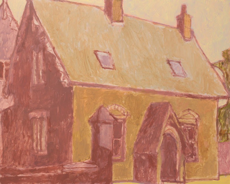
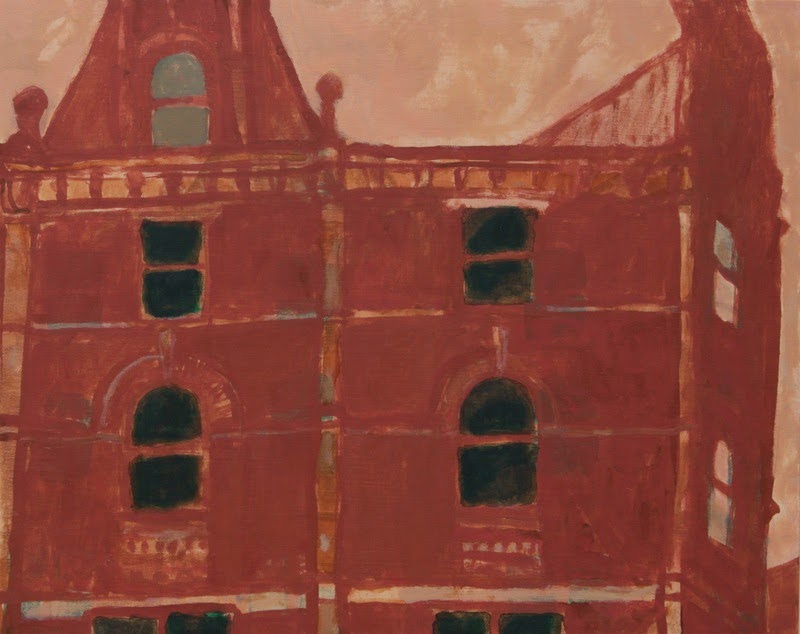
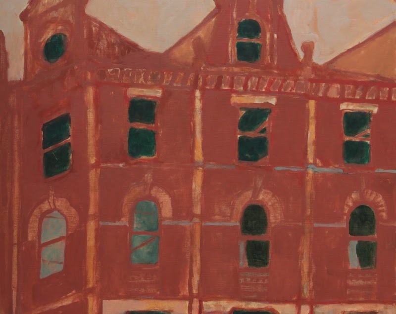
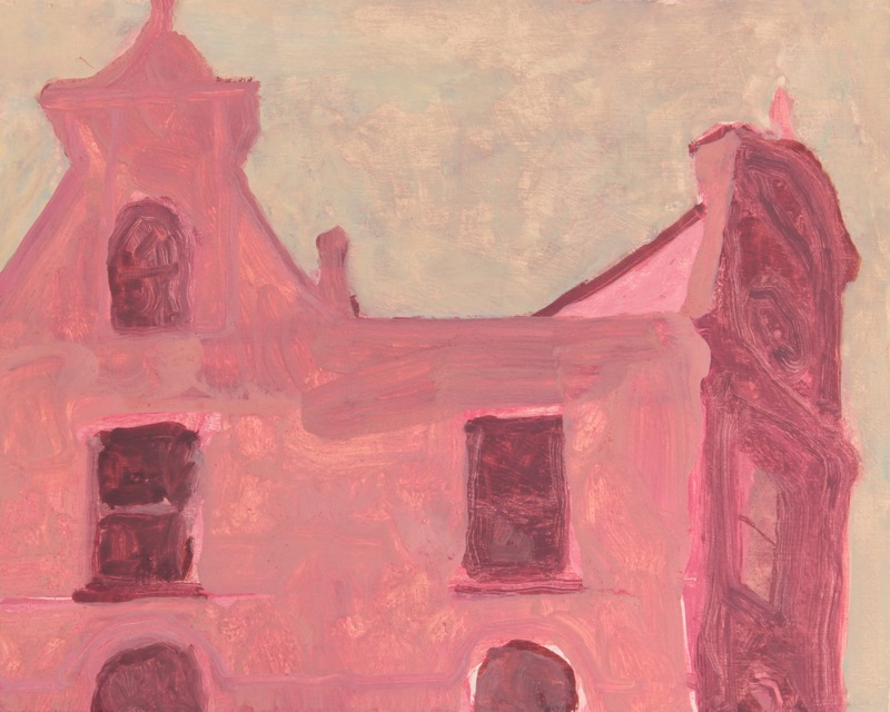
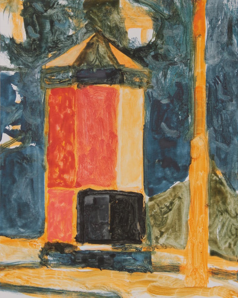
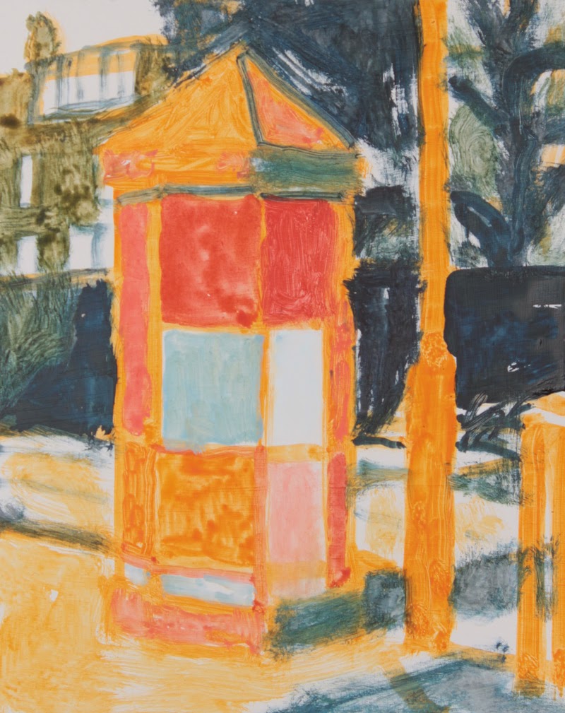
I love the Lodges series. It feels as though you’ve captured some symbol that represents human folly, as well as a gateway between past and present, history and progress. Can you talk a little about the inspiration and execution of these works?
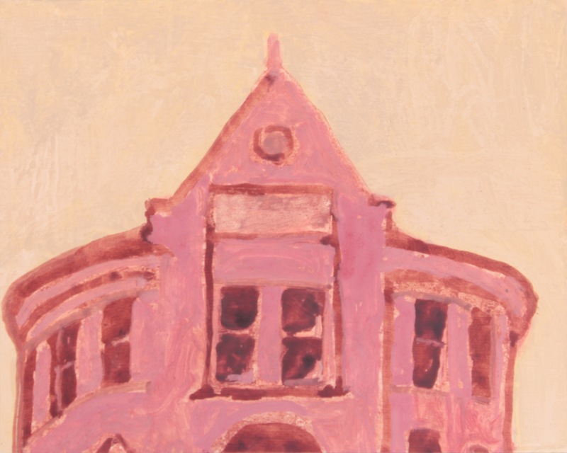
Thank you. For a while I’ve been looking for something different, something that would sustain a long series of work that would have a rather different focus from the paintings of houses, while still starting from the exploration and documentation of my neighbourhood. By chance I came across an article by a local historian on these lodges, which I found fascinating. I realised I’d always been aware of these strange little buildings dotted around Headingley without ever really looking at them properly, or thinking about their history and their part in the history of the city.
In the nineteenth century, this part of Leeds consisted of large houses with parkland, owned by wealthy manufacturers or bankers, and these lodges were the gatehouses to their estates. In the twentieth century, the estates were sold off, and many of them were built on or transformed, but a lot of the lodges remained — looking incongruous surrounded by the red-brick terraces, semi-detached houses, busy streets and modern buildings of Headingley. Although small, they were built to show off the landowners’ wealth, and they often have elaborate or outsized details: the architecture is sometimes called “gingerbread style,” a term I like, which captures this strange combination of qualities.
This makes for a very different subject from my normal one — in my paintings of terraces and semis, I am looking at a familiar, ubiquitous, everyday architecture — making paintings of the sorts of house that I live in and have lived in since I moved to Leeds in 1991. The lodges, on the other hand, are unique, individual, strange, and with a sort of self-consciousness that most domestic architecture doesn’t have.
As well as this change in subject, I am also making these paintings in acrylic rather than oil — I wanted to shake up my technique and I thought that a change of medium might help with that. I’m doing more reworking and overlaying than I do in oil, because of the freedom acrylic gives for this, and I’m using different brushes, a different consistency of paint, and different ways of mark-making.
I’m also using rather colour differently, partly through conscious choice, and partly as a result of the different behaviour of the different medium and different pigments — I’m using more variety of colour within a single image, and a more muted palette, although I am still interested in exploring the ways colours interact with each other.
This project is very much an exploration — I don’t know whether, and how, it will feed back into my main work when it ends, and I don’t know whether these pieces will sit comfortably alongside my other work, or form something completely separate. I would really like to find a way to show them together as a group when they’re finished — ideally in a physical exhibition, otherwise in a catalogue or a website.
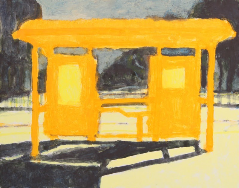
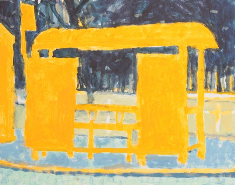
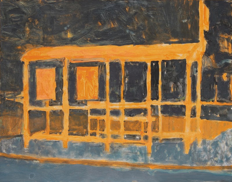
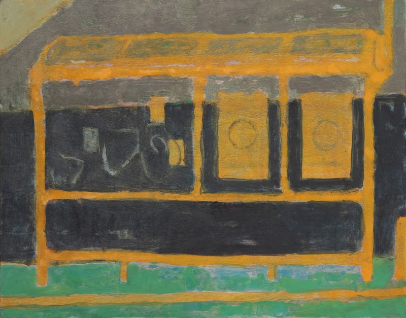
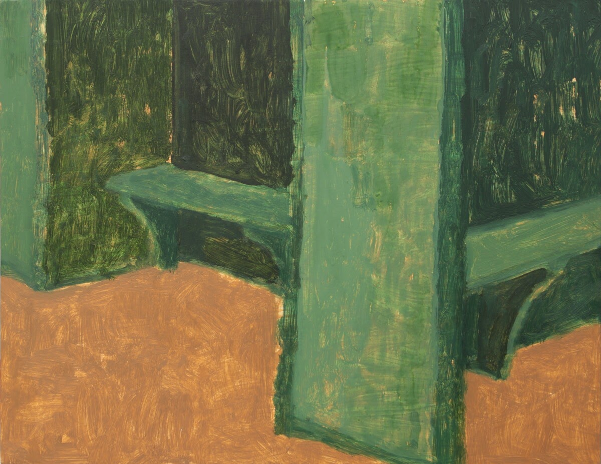
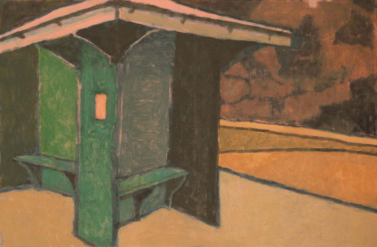
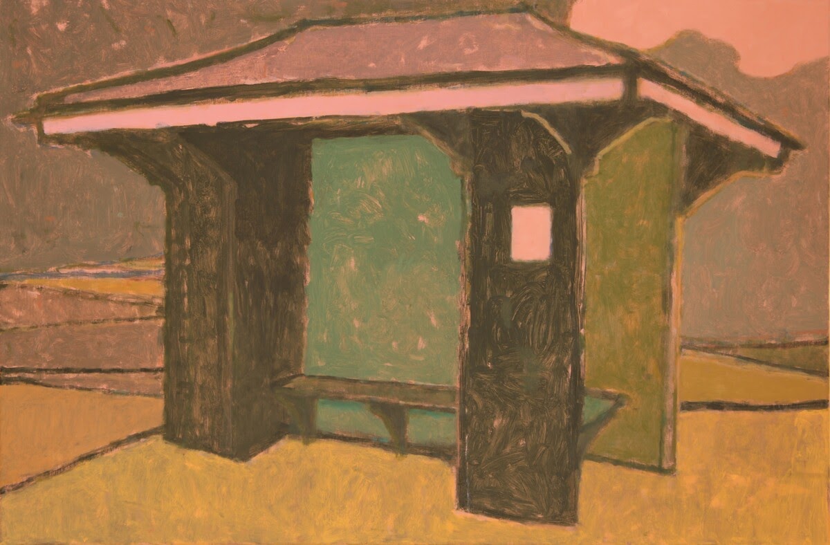
In a similar vein, I also love the paintings/drawings in which you capture transitional spaces: bus shelters, park shelters, poster kiosks. It’s as richly familiar and human as houses or stores, but there’s an in-between feeling about it. (and the lights and shadows and patterns you capture are so beautiful to me!) What draws you to these places?
That in-between-ness is something I like — and the fact that these are things seen but not noticed, familiar but often profoundly strange. Like the lodges, these were partly an attempt to find a complementary subject to my houses. And as you say these are very human subjects — in their size, arrangement and function.
The park shelters are a little unique in my recent work in that they have a sort of deliberate meaning: they were paintings about the COVID lockdown. At the time when we could only go out for an hour each day, our local park became a very special place for us — even though for a long time we were not even allowed to sit down on the park benches. We walked to the park, walked round it, and then walked home, all without talking to anyone. This seating shelter encapsulates that time for me, and I intended it as representing the idea of “shelter” more generally. It’s also a fascinating and satisfying structure — similar to some of the lodges I’m painting at the moment.
I feel like I ask this a lot of artists, particularly of artists who address urban landscapes, but it’s endlessly fascinating to me. Your work revolves around places where humans live and shop and wait, but there are no humans in your work. Our influence is everywhere, but our presence in the form of a human figure is nowhere. What is your idea of the relation of humans to place, history, the environment, the world, your art?
Human life is central to what I make and how I make it: on an obvious level, buildings and urban spaces only exist for people. Also, the act of painting, and of looking at a painting, is a physical human activity of our bodies as well as our eyes. I make work to show other people my own experience of the world around me, and to offer them an opportunity for their own experience and memory.
I think the images of houses imply a human presence without the need to depict it. When I started my Leeds paintings in 2009 I often did include people and vehicles. I stopped for three reasons: first they are a distraction — they imply a narrative rather than focussing on the building or place. Second, they tie the painting to a particular time whereas I want to imply the longer history of the building, its past, present and future. Third, I think a painting without people invites the viewer to inhabit the image themselves, and to experience it more privately and personally.
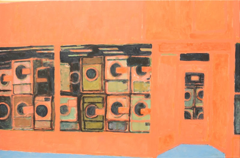
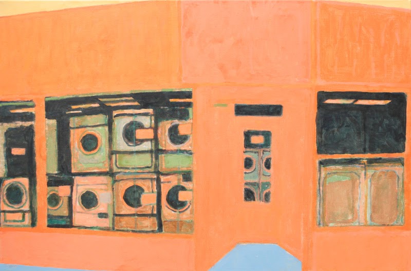
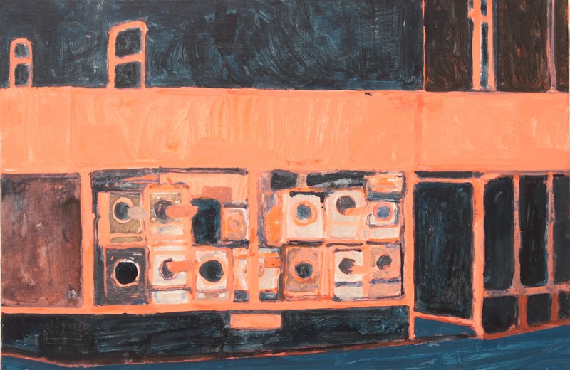
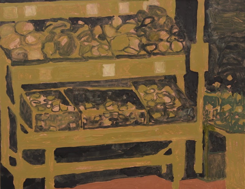


This is a related question for me, and I’m sorry if it’s redundant. I’ve been fascinated for a long time with the ordinary or mundane and how beautiful that can be in life and art if you look at it a certain way. Your paintings of appliances or vegetable stands were very moving to me. As markers of universal human concerns, but, I don’t know, just aesthetically as well. They seemed to float as a symbol of how we move through modern cities or suburbs, but also as an idea of what connects us as humans. They also represented more mundane details than I saw in a lot of your other work. How do you decide how much detail to include?
With these paintings in particular, one of the things I liked was the ad hoc, utilitarian nature of the subjects — they are still lives arranged not for aesthetic reasons or to convey a message, but for the convenience of shopkeeper and customer. The wooden stands for fruit and veg in particular are wonderful constructions — irregular, and extended and repaired over time.
As you say I don’t normally include much detail in my work, but for these paintings to an extent the detail is essential to the subject. I worked this out in a lot of watercolour drawings before I started — I didn’t have a preconceived idea of how I’d approach them, and how much detail I’d include, and how I’d render it. As I worked on the drawings it somehow came together in a way that worked.
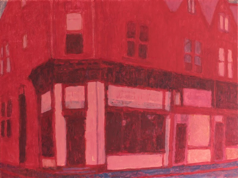
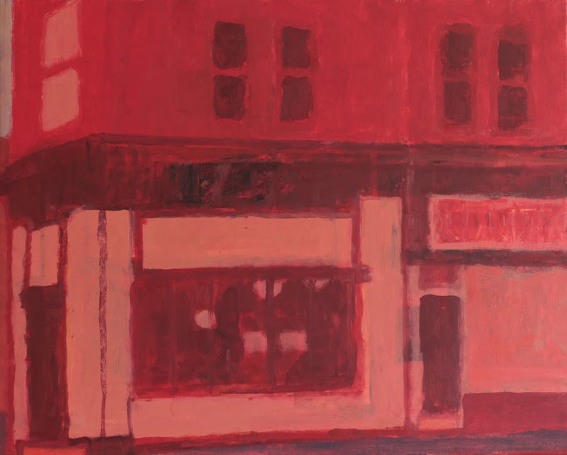


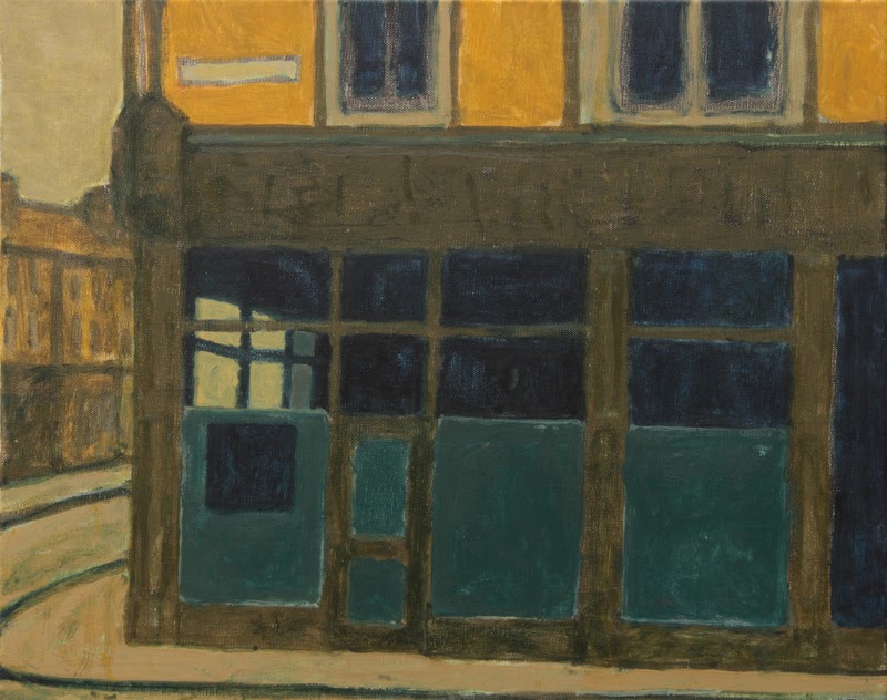
The windows! I love the windows in your work (and the colors of them), whether they’re opaque and reflecting the sky or translucent, whether you can see through them and through another window in the background to a curving street beyond, whether they reflect a closed, private light, or a glimpse of slanting light within a room. Storefronts or homes. Can you talk about what windows mean to you and how you approach their execution in your work?
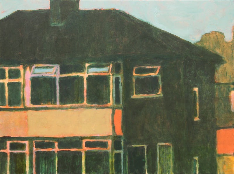
Thank you. I particularly like the original wooden sash windows, gables, and bays that still exist in some houses around here (though they’ve mostly been replaced with modern plastic double-glazing).
One thing that interests me about windows is that they allow for a sort of broken symmetry — when a pair of semis was built, or a row of terraces, each house was exactly the same, a mirror image or a repeat of the other. But changes to windows and doors over time mean that a pair of semis is never perfectly symmetrical, and each house in a terrace is unique. This imperfect symmetry is something I find useful as a compositional device. And windows do provide nice rhythmic elements to the picture in an abstract sense, as well as providing a human reference and scale.
When I paint windows on houses I almost never show anything of the inside of the house. This is partly out of respect for the people whose home it is. Also partly because the photographs I work from tend to flatten everything into either bleached-out white reflections of skies, or impenetrable black shadows. And I want to focus on the outside of the building, and for the inside to be part of the personal interpretation a viewer brings to the picture. With shop-fronts on the other hand I quite often give something of the interior space — I quite like the partial and dim views you get into the interior space through the plate glass windows.
Jonathan Hooper is a painter based in Leeds. He grew up in the Chilterns, and studied at Bucks College of Higher Education, Falmouth School of Art and Design, and the University of Leeds.
His subject is the built landscape of the city of Leeds, in particular the residential architecture of the suburbs to its north-west.
He was awarded the Milner Prize for an Emerging Artist at the NEAC Annual Exhibition 2024, and was shortlisted for the Jackson’s Painting Prize in 2023. He was one of the five painters in the group exhibition Where We Live which toured England in 2021-23. See more of his work on his website and on Instagram.
Categories: art, featured, featured artist, interview


Wonderful interview! I thoroughly enjoyed the dialogue and it gave great insights into the different series Hooper is working on. A pleasure to read and to look at!
LikeLike
LikeLiked by 1 person