


By Robert Beck
It’s like any of the questions you ask yourself when trying to communicate with someone. Who is your audience, where do you start, what are the key points to touch on, how much is too much information? What kind of delivery will work best? A painter has a few more options to consider. Scale, composition, color harmony. The spoken word is short-lived, but the painted image is there as long as the observer cares to look at it.
The art school trope is: if you can’t make it good, make it big; and if you can’t make it big, make it red. But black and white is a vernacular of its own, unconcerned by color relationships, and sometimes it’s the best way to get an idea across. A clear melody instead of full orchestration.
Taking photos was more difficult and less available to the average person until the digital age. My dad had a darkroom in the basement, and that’s where I learned to appreciate the language of light. City dwellers with a passion for photography would build a darkroom in their closet. Now everyone has a camera at their fingertips, and in the city, somebody lives in the closet. More than a century was defined by black & white photos, but now the B&W genre, especially the chemical kind, has become a niche, artisan practice. Color photography has evolved from looking for a naturalness or truth in hue to a point now where it is easily manipulated in any direction, and photographs themselves can’t be trusted. Of course, paintings never could.
A lot of my New York memories emerge as black & white, even if they eventually hold ground in color. I’m greatly influenced by my father’s photos and those afternoons as a kid spent after school watching programs on our B&W television. Magazines and movies turned the world to color, but it was clear that was just dazzle, and you could tell a good story without it. Sometimes better. Black & white comes in the door with an edge, talking tough in a fedora. Like New York. It suggests the viewer consider the historical aspect, and not be distracted by a gleam of decoration. It seemed right for this painting.
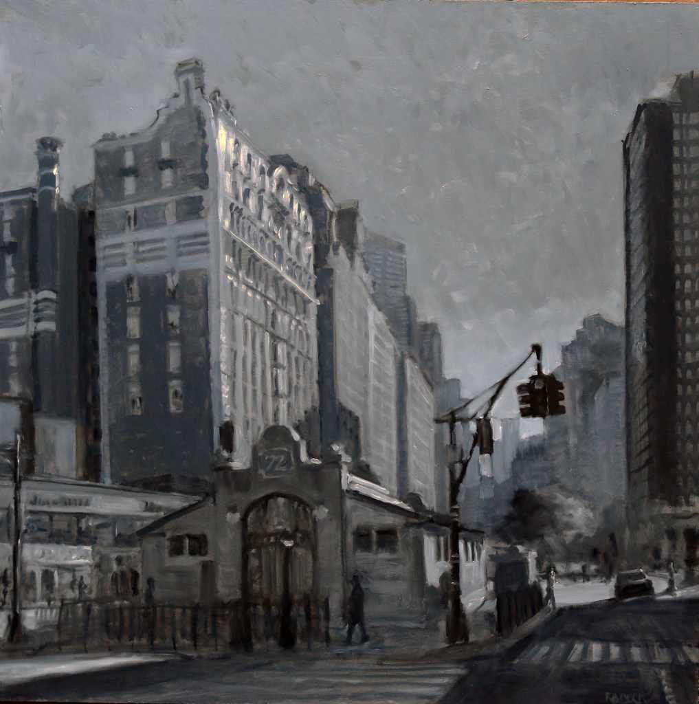
I wasn’t sure how I wanted to portray the South Subway headhouse at the 72nd St. station, and I walked around imagining how it could be presented from various vantage points. I looked through the door glass on the north side and watched a couple of people pay their fare and go down to the platform. One guy waited until the others were through, then he took off his backpack and ducked under the turnstile. He was down the stairs in a flash. Obviously, he makes a practice of it because he has the moves down pat. I wondered if I would be thrown out if I set up my easel inside there. Of course I would.
There are many black and white pigments to choose from when painting. I used ivory and lamp blacks with titanium and flake whites. Those gave me warm and cool grays, plus other neutrals on my pallet, and many lighter and darker shades depending on the proportions of the mix. It’s not a huge temperature range, but enough to play with.
It helps to think of warm and cool as warmer and cooler than what the color is compared to. Just like “large” isn’t a thing, “warm” isn’t a thing. But “warmer” is. It is a comparison to something. Having these warm(er) and cool(er) grays lets me do fun things, like suggest light and shadow. I can push areas of the image away by cooling them and bring others forward with some warmth. That glimmer on the tall building is made of cool white on the warm façade—purposely in opposition—so it reads separate and distinct from the building, like a sunlight reflection, and not a white-color top of a building.
It’s not so much the headhouse’s details that attract my attention, as it is that mission-like design. It sits squat in the open square, ringed at a distance by shoulder-to-shoulder tall buildings that are held in abeyance by…what? Time, I suppose. For now, it looks like a subway station outside of Albuquerque. There is sky and clouds and air. If a sunny day happens, you can find it here. It’s a place where a New Yorker might be tempted to look up.
Robert Beck is a painter, teacher, curator, lecturer and writer who divides his time between Bucks County, PA and New York City. See more of his work at Robertbeck.net, on Instagram @illhavecoffeethanks, and on Facebook .
Categories: art, featured, featured artist

